Why ‘Busy’ Doesn’t Equal ‘Fast’
You look at your team’s dashboards. The activity metrics are green. Tickets are being closed, code is being committed, and marketing assets are being produced. By all accounts, everyone is incredibly busy.
And yet, you have a nagging feeling that things are slow. A feature that felt like it should take a month takes a whole quarter. A simple marketing campaign gets stuck in review cycles for weeks. There’s a disconnect between the frantic activity you see and the actual value being delivered to customers.
This isn’t a feeling. It’s a symptom of a hidden problem that plagues almost every scaling company: inefficient flow. As the famous business fable The Goal by Eliyahu M. Goldratt suggests, a system is only as fast as its slowest component. Before you can architect a better workflow, you need a map of the current reality. That map is called a Value Stream Map.
An X-Ray for Your Workflow
Most people mistake Value Stream Mapping (VSM) for a simple flowcharting exercise. It’s not.
A flowchart shows the steps in a process. A Value Stream Map does something far more powerful: it reveals the two critical metrics that define your organization’s true speed.
- Process Time: The time spent actually working on a task. (e.g., 4 hours to write the code, 2 hours to design the graphic).
- Lead Time: The total time that passes from the moment a request is made until it is delivered to the customer.
As Mike Rother and John Shook teach in Learning to See, value stream maps often reveal that processing time is only a small portion of total lead time — the rest is waiting.
Waiting for approval. Waiting for information from another team. Waiting in a queue for a shared resource like a QA engineer or a legal review.
This waiting time is the “Operational Debt” that is silently killing your company’s momentum. Value Stream Mapping isn’t just a tool to draw boxes and arrows; it’s a diagnostic tool to make that invisible waste painfully visible.
The 5-Step VSM Blueprint
As a Director, your role isn’t to draw the map yourself. It’s to empower your managers to do it. Here is a simple, actionable blueprint you can give them to run their first VSM session for a specific workflow (e.g., the content creation process, the bug-fixing process).
Step 1: Define the Scope & Assemble the Team
- Action: Choose one, and only one, value stream to map. Define the clear start and end points. For example: “From the moment a new feature idea is approved, to the moment it is deployed to production.”
- Action: Assemble a cross-functional team in one room (physical or virtual). You need at least one person who represents each major step in that process (e.g., a Product Manager, a Designer, a Developer, a QA Engineer, an Ops Engineer).
Step 2: Map the “As-Is” State
- Action: Using a whiteboard or a digital tool like Miro, map out every single step in the process. Use sticky notes for each step.
- The Critical Part: Between each step, add another sticky note to represent the waiting time. Ask the team: “After the design is done, how long does it typically wait before a developer picks it up? An hour? Three days?”. Be brutally honest.
Step 3: Add the Data
- Action: Go back through the map and add two numbers to each step:
- Process Time (PT): How long does this step actually take to do?
- Lead Time (LT): How long does it take from the start of this step to the start of the next step? (This includes the waiting time).
Step 4: Identify the Waste
- Action: Calculate the total Process Time and the total Lead Time for the entire value stream. Then, calculate the Process Cycle Efficiency (PCE):
(Total Process Time / Total Lead Time) * 100%. - The “Aha!” Moment: The team will see a number that is likely shockingly low (often below 10%). Now, circle the biggest waiting times on the map. This is where your biggest opportunities for improvement lie.
Step 5: Design the “Future State”
- Action: Don’t try to fix everything. Ask the team one powerful question: “What is one change we could make in the next 30 days that would cut the biggest waiting time in half?”
- Action: Brainstorm solutions, agree on one concrete experiment, and assign an owner. This becomes an actionable improvement item for the next work cycle.
Example: Value Stream Map — “From Feature Approval to Production Deployment”
1. Define Scope & Roles
- Start: Feature idea approved
- End: Feature deployed to production
- Team Involved: Product Manager, Designer, Developer, QA Engineer, Ops Engineer
2. Current State (As-Is) Map
| Step | Process Time (PT) | Lead Time (LT) | Waiting Time | Notes |
|---|---|---|---|---|
| 1. Feature Design | 8 hrs | 3 days | 16 hrs | Waiting for designer availability |
| 2. Design Review | 2 hrs | 4 days | 30 hrs | Waiting for multi‑stakeholder approvals |
| 3. Development | 24 hrs | 10 days | 56 hrs | Context switching slows devs |
| 4. QA Testing | 6 hrs | 5 days | 34 hrs | Shared QA resource backlog |
| 5. Deployment | 2 hrs | 2 days | 14 hrs | Coordination with Ops team |
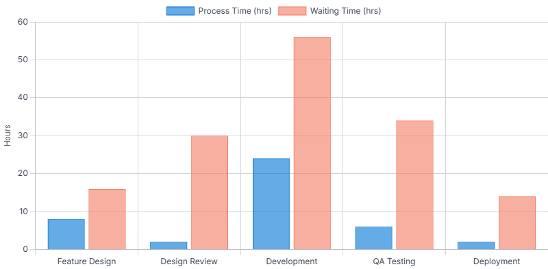
Totals:
- Total PT: 42 hrs
- Total LT: 24 days (~192 hrs PT + waiting)
- Process Cycle Efficiency (PCE): ≈ 21.8%
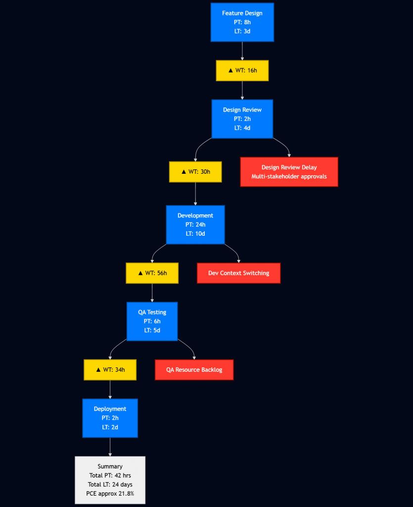
3. Key Waste Identified
Despite high activity levels, the Value Stream Map revealed that only 21.8% of total lead time was actual work. The rest was waiting. Three major sources of waste emerged:
- Design Review: 30 hours of waiting due to multi‑stakeholder approval queues.
- QA Testing: 34 hours of waiting caused by shared QA resource constraints.
- Development: 56 hours of waiting driven by frequent context switching and multitasking.
While each significantly impacts performance, their short‑term improvement potential varies — and this assessment forms the basis for selecting the primary focus for the next 30‑day improvement cycle.
4. Future State (Next 30 Days Goal)
Primary Bottleneck to Target: QA testing wait time (cut in half)
Why QA Testing over Development and Design Review?
Although Development had the highest waiting time (56 hours), its delays were driven by context switching and multitasking — issues that require deeper cultural and structural changes, making them less feasible to resolve in a 30‑day window. Design Review, while contributing 30 hours of waiting time, was slowed by multi‑stakeholder approval queues, which are also harder to streamline quickly.
QA Testing, with 34 hours of waiting, presented the clearest short‑term improvement opportunity. Its bottleneck stemmed from shared resource constraints, a problem well within the team’s control to address in the next sprint by introducing dedicated QA time slots and automating regression tests. Choosing QA first delivers a quick, measurable lift in Process Cycle Efficiency (PCE), paving the way for tackling more complex bottlenecks like Development and Design Review in subsequent cycles.
Proposed Change:
- Introduce dedicated QA slot per sprint
- Automate regression tests to free QA bandwidth
Expected Impact:
Reduce QA lead time from 5 days to 2–3 days, improving Process Cycle Efficiency (PCE) to ~28–30%
From Insight to Advantage
As a Director, the output of this exercise is invaluable. The Value Stream Map gives you a data-driven, objective view of where your operational problems truly are. You no longer have to rely on gut feelings or anecdotal evidence.
Mini Case Study: From Bottleneck to Breakthrough
At one SaaS company, a new feature was consistently taking 3–4 weeks to reach production, despite only requiring ~40 hours of actual work. After running a VSM session, the team discovered that QA Testing was the bottleneck—waiting times exceeded 30 hours due to shared resources and unclear handoffs.
By introducing a dedicated QA slot per sprint and automating regression tests, they reduced QA lead time from 5 days to just 2. The result? Time-to-market dropped by 40%, and sprint velocity increased without hiring a single new engineer.
This is the power of VSM: it turns invisible delays into visible leverage.
Strategic Decision-Making
When you need to decide where to invest your resources—should you hire another engineer, or invest in a better handoff process with marketing?—the map will give you the answer.
By systematically identifying and reducing the waiting times in your value streams, you are not just making your teams “more efficient.” You are directly reducing your time-to-market, accelerating your ability to deliver value to customers, and building a resilient, scalable operating system.
Mapping is the first step. Architecting the new flow is the next. As described in The DevOps Handbook, this continuous improvement loop is the cornerstone of high-performing technology organizations
Further Reading
Want to dive deeper into the concepts of Value Stream Mapping and operational efficiency? These are some of the most influential books on the subject:
- The Goal by Eliyahu M. Goldratt: An excellent business novel that introduces the Theory of Constraints and the importance of identifying bottlenecks.
- Learning to See by Mike Rother & John Shook: Often considered the “bible” of Value Stream Mapping, this book provides a practical, step-by-step guide to the process.
- The DevOps Handbook by Gene Kim et al.: This book applies Lean principles, including VSM, to modern software development and IT operations.
Discover more from HOGOFLOW
Subscribe to get the latest posts sent to your email.